# Setting height and width
Learn how to set the height and width for your images with the API.
## Setting height & width in HTML
When sending an HTML snippet to the API it will auto crop your image to the height/width of the **outermost HTML element**.
* The following example uses an element that is 400 CSS pixels wide and 200 CSS pixels tall. At the default `device_scale: 2`, the output is 800 × 400 image pixels.
**Note**: _This works for HTML snippets only. Full HTML pages (has `` and `` tags) will not automatically crop._
A 400 × 200 CSS pixel element. At the default device scale of 2, the output is 800 × 400 image pixels.
```html
Hello, world
```
See how in the code sample we have set the `height: 200px; width: 400px;` in the outermost `div`.
### Adding margins around the image
Margins are respected by the auto crop. To add some space around your image, you can add `margin: 20px` to the outermost element.
A 400 × 200 CSS pixel element with a 20px margin on each side. At the default device scale of 2, the output is 880 × 480 image pixels.
```html
Height and width example
```
## Setting the viewport
When rendering your image, we use a live instance of Google Chrome running on one of our servers. In Chrome, the viewport is the total viewable area rendered by the browser.
* By default, the viewport is set to: `1920x1080`. If you use the API to screenshot a `url` or send a full HTML page, you will get back an image rendered inside the default viewport.
* You can customize this by adjusting the [`viewport_height` and `viewport_width` parameters](/parameters/viewport/#viewport-width-and-height) while creating your image.
* We recommend using this for images rendered by `url` or when sending a full page. HTML snippets are better sized using automatic cropping and height/width in CSS.
## Understanding high resolution (retina) images
Every device has a **DPR (device pixel ratio)**. Higher quality screens will have a 2x or higher DPR. This means, for crisp/clear images, they need 2x or 3x as many pixels as a traditional, lower resolution screen.
* We render HTML/CSS images **@2X** by default.
* This results in a high quality image that will work well with any monitor.
* When specifying **400px** in your HTML, the resulting image will be **800px** to account for high resolution screens.
## Resize on the fly with query params
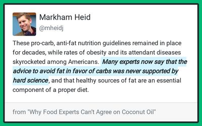
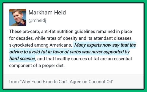
Every image generated by the API can also be adjusted on the fly with the `height` and `width` query params.
* This is useful for displaying images at different resolutions without having to setup your own CDN.
* When only one param is passed, the API will maintain the aspect ratio of the original image.
### Examples
**?width=400**
**?height=300**
### Advanced cropping
For more precise control over your images, you can use advanced cropping parameters like `aspect_ratio`, `x_1`, `y_1`, `crop_width`, and `crop_height`. See [Cropping parameters](/getting-started/using-the-api/#cropping-parameters) for details and examples.
## Height and width for print
Images generated by the API can also be used for print. Learn how to convert pixels to DPI (dots per inch).
* **Inches to CSS pixels, at `device_scale: 2`:** `(DPI * size in inches) / 2 = CSS pixels`. For a different device scale, divide by that scale instead.
* DPI = Dots Per Inch. For a high quality print, you will want 300 DPI.
### A4 paper example
For a 300 DPI print on A4 (8.27 x 11.69 inches) paper, you would do the following:
* Width: `(300 * 8.27) / 2 = 1240 pixels`
* Height: `(300 * 11.69) / 2 = 1754 pixels`
### Business card example
For a 300 DPI business card (3.5 x 2 inches).
* Width: `(300 * 3.5) / 2 = 525 pixels`
* Height: `(300 * 2) / 2 = 300 pixels`
Once you have determined your height and width in pixels, you can then set your HTML to render the exact size you need. We recommend doing this by adding `height` and `width` style parameters to the outermost HTML element in your code.
### DPI metadata tag
If you need the DPI metadata tag set on your image, you can do this by adding the query param to your image url. For example `hcti.io/v1/image/123abc?dpi=300`. Please note, you will still need to use the calculations above to create an image large enough to have the correct DPI when printed.
### Jumbo images
If you need to render really large images without sacrificing quality, you’ll want to set the `jumbo_max_width` and `jumbo_max_height` parameters. [Learn more](/guides/advanced/jumbo-images).
## Need help?
Talk to a human. Email [support@htmlcsstoimage.com](mailto:support@htmlcsstoimage.com) and we’ll help you get started.