
Simple Text
Use Simple Text when one block should render one text value with a shared style. Choose Simple Text Box in the left sidebar. Edit its content and text properties in the right sidebar.
Common properties
Most blocks share these controls in the right sidebar. Selecting a child also shows controls for its parent layout.
| Property | Details |
|---|---|
| Size | Width can be fixed, percentage-based, or automatic. Height can be fixed, flexible, or constrained by minimum and maximum values. Lock the aspect ratio to preserve proportions. Size values support variables. |
| Arrange | X and Y position blocks on the canvas or inside Free Panels, using fixed values or percentage anchors. Alignment controls place blocks at common positions. Rotate, flip, lock, or change the layer order. |
| Background | Choose a solid color, a linear, radial, or conic gradient, or a pattern. Colors support variables. Gradient stops have colors and positions and are sorted by position; linear and conic gradients also have an angle. Pattern colors and size support variables, with controls varying by pattern. |
| Border | Simple mode shares color, thickness, style, and radius across all sides. Advanced mode sets each side's color, thickness, and style and each corner's radius independently. |
| Shadow | Add layers of regular shadow, inner shadow, or glow, subject to the block-specific limits below. |
Canvas and block backgrounds are separate: transparent areas reveal the parent or canvas. Patterns are based on CSS Pattern. See Sizing and positioning for sizing modes and position anchors.
Text blocks support drop shadows and glow, without inner shadows or spread.
Block-specific properties
Section titled “Block-specific properties”| Property | Details | Variables |
|---|---|---|
| Content | Text rendered by the block. | Yes |
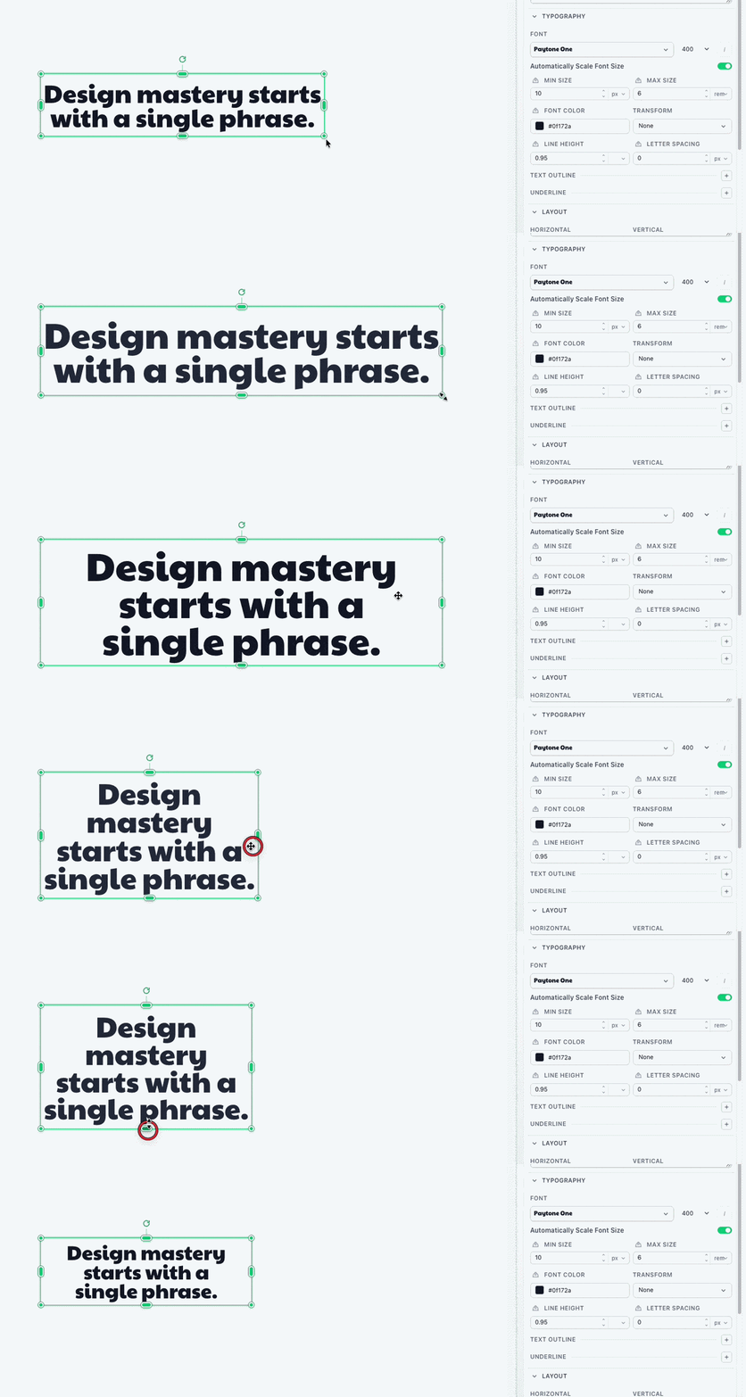
| Auto font size | Scale text to fit within the font-size range. | Yes |
| Minimum font size | Smallest allowed size when auto font size is enabled. | Yes |
| Maximum font size | Largest allowed size when auto font size is enabled. | Yes |
| Padding | Space inside the block edge. Simple mode sets all sides; Advanced mode sets each side. | — |
| Opacity | Transparency of the whole block, including content and styling. | Yes |
| Font | Font family, weight, and italic style. | — |
| Font color | Text color. | Yes |
| Line height | Space between lines. | Yes |
| Letter spacing | Space between letters. | Yes |
| Horizontal align | Left, center, or right alignment. | — |
| Vertical align | Top, middle, or bottom alignment. | — |
| Underline | Underline style and color. | Yes |
| Text outline | Stroke around text. | Yes |
| Transform | Text casing. | — |
Auto font size
Section titled “Auto font size”Auto font size scales text to fit the block while staying within your range. Enabling it makes Minimum font size and Maximum font size available. Turn it off to keep one specific font size.
Templated content
Source the Content property directly from a variable. Do not put Handlebars syntax in the text itself.
Many properties can use variables to assign their value when each image is created. Variables can be required, ignored, or given a fallback value. Pass values in template_values when rendering the template.